Sent to you by nunok via Google Reader:
Last year Facebook changed the design and user interface for the Facebook personal profiles. They introduced key features such as the new timeline and a large area at the top for a photo or image in a banner format.
These changes were an indication of what was to come for the Facebook brand and business "Pages".
Last week Facebook announced that the new design for "pages"was indeed a reality and all businesses will need to adapt their Facebook "Page" to the new design and functionality by March 31.
If you want to change it before that time then you can, but remember in less than 30 days all Facebook "pages" will be moved over to the "New" design.
So what are the key changes and what are some of the implications for marketers?
1. New Design
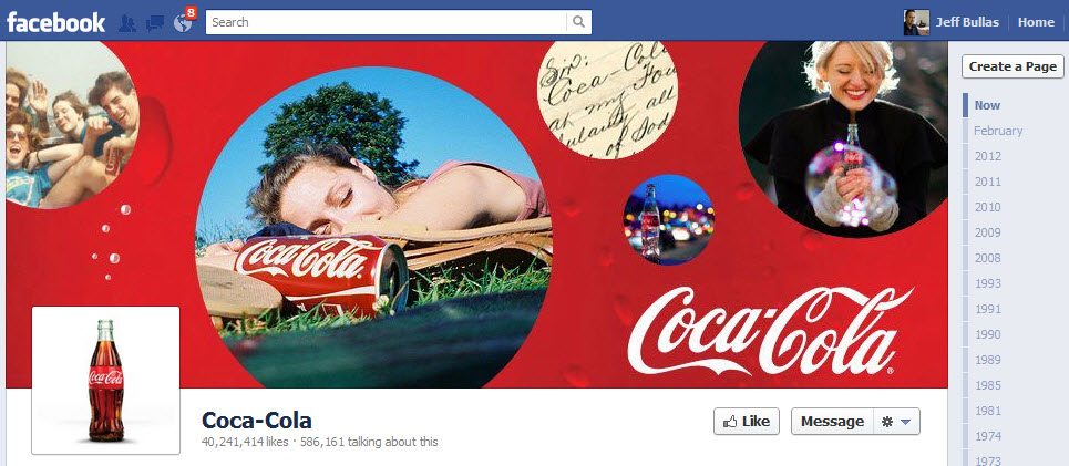
The new design and user interface provides a much bigger area for displaying a compelling image that can highlight the business brand. The format will now be two columns that will reflect the evolving story of the brand over time.
This image area now measures 850 by 315, so you will need to create images that work with that space.
Their terms of use for these images do not permit you to include prices or promotional information, contact info, calls to action or references to any Facebook features such as "Like' or "Share"
2. Private Messaging
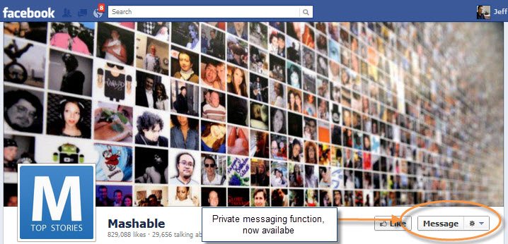
Businesses will now be able to communicate with private messages with their fans and users. What this means that previously public conversations with users can now be done in private if required.
This will allow a more intimate engagement with customers and prospects. This feature can be turned off if required.
3. No Default Landing Page
In the current design which will be superseded at the end of the month you were able to set a default landing page. This allowed the administrator of the page to control what page appeared as your default Facebook landing page. This means that practice of "Fan gating" pages to garner more organic "likes" will not be able to be done any more by driving people to that custom tab.
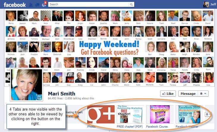
4. Only 4 Tabs are Visible
All tabs were visible with the old design on the left hand side of the Facebook page previously you were able to put your custom tabs. The implications of this is that you will need to choose wisely which tabs you want to place here.
The photos tab is not able to be moved or changed but you can control which of the other 3 tabs you want to feature including icon images.
5. Featuring Content
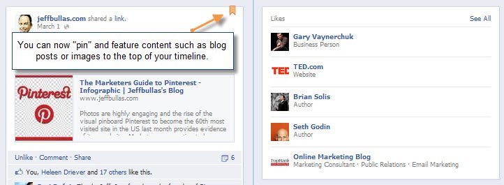
You can now "pin" content that you want to appear at the top of the "Timeline". This will allow you to feature content such as blog posts, images or calls to action in this prominent position.
This is indicated by the the yellow "marker at the top right.
So what do you think about the new changes?
How will you adapt your Facebook page to the new design and functions?
More Reading
- Do Shared Links Last Longer on Twitter or Facebook
- What 3 Content Types Drive the Most Interaction on Facebook
- How to Increase Your Blog Traffic by 55% with One Button
- 5 Motivations for Sharing Content
- 20 Ideas for Social Media Content that Engages
- Is it Better to Share on Google, Facebook or Twitter?
- 9 Questions to Ask your Customers When Creating Content
Image by sherifer22
Things you can do from here:
- Subscribe to Jeffbullas's Blog using Google Reader
- Get started using Google Reader to easily keep up with all your favorite sites


No comments:
Post a Comment